
PRODUCT DESIGN
A Mobile App Empowers the Workforce
myWorkHub* is a mobile app which maps out available work spaces for those working away from the office or home. Freelancers, travelers, students and business travelers all seek spaces outside home or office to vary the scenery and ultimately be more productive.
CLIENT
myWorkhub
ROLE
Creative Director, Product Designer
INDUSTRY
Technology
DELIVERABLES
Product Design (UX/UI, Research, Testing), Logo, Visual Identity
.
The case study below will guide you through my UX Design process, following best practices in research & analysis, testing & iteration, content strategy, architecture, and design.
Research & Analysis
I’ve worked in a number of cafés and coworking spaces so I felt I had a good idea of café culture, but this certainly wasn’t enough to start on. It was important to go to the source. For this, I went to a couple of local cafés and observed interviewed several people about their work habits. In addition to this I created an online survey which gave me some statistics and data to use to start to flesh out user personas.
The results were an eye opening experience for me, as I discovered a number of use case scenarios which I hadn’t considered. Additionally, I asked participants about any apps they had used to find workspaces. This helped me narrow down the other apps that served this market, and gave me a list of competitors products to review.

69.2%
WORK IN CAFES FOR A CHANGE OF SCENERY
45.2%
OF CAFE WORKERS ARE FREELANCERS
30.2%
COME TO CAFES TO BE MORE PRODUCTIVE
Personas & User Stories
Research yielded some surprises and a better understanding of who these users would be. I compiled my data into creating 4 different personas based on the personalities I encountered in person and within survey results. The users fell into 4 basic categories: The Freelancer (Jason). The Student (Amanda), The Business Traveler (Max), and the Office Worker (Carol). Each of these users had slightly different motivations for coming to a café or community workspace.
Jason
The Freelancer
Age 28
As a Creative Professional
I need to Find a place that's
esthetically pleasing and not
too corporate
So I can Get work done and
feel connected to culture.
Max
The Urban Professional
Age 35
As a Tech Worker with a
new baby at home
I need to Find a quiet place
where I can focus
So I can Perform optimally
at my job
Carol
The Office Worker
Age 44
As a Working Mother
I need to Find a place that's
comfortable and convenient
So I can Get more work done
during my busy day
Amanda
The Student
Age 23
As a Grad Student
I need to Find a place that's
locally owned
So I can feel a sense of
community while I get
my work done
Content Strategy
& Information Architecture
After devising an outline of content I conducted a card sort with a few sample users in the sample demographics. I discovered that based on the user’s field or profession, they might have a different way to label the different sections or functionalities. In this case, I determined it was best to use the terminology of the users most likely to interact with the app and go from there. The card sort helped me determine the most intuitive method of organizing the app, and in turn helped me develop user flows and site architecture.
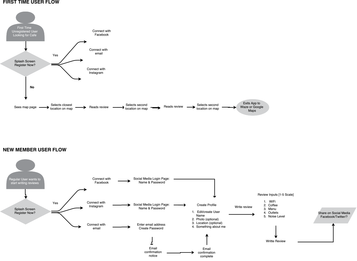
Wireframes, Prototyping & Validation
Armed with data regarding user flows and architecture, I came up with a few wireframe sketches in Basalmiq and loaded them in the InVision app. I conducted some user testing so see what the response was to the initial interface design. The design was rough but it enabled me to gauge reactions to the initial iconography and layouts and get feedback. Testing revealed that initial views were a tad too complex, so I addressed that with my second round of iterations.
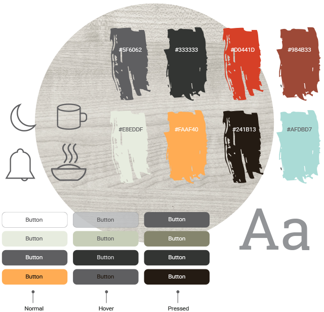
Visual Design & Brand
I selected a palette which reflects both cafe and work environments, which rely heavily on the rich colors of coffee and wood. The typeface, Roboto Slab, is both modern and classically rooted. The UI Iconography was left spare and streamlined for a modern and light presence.
The corporate logo is a play on the letterforms as well as the idea of coworking and connectivity.
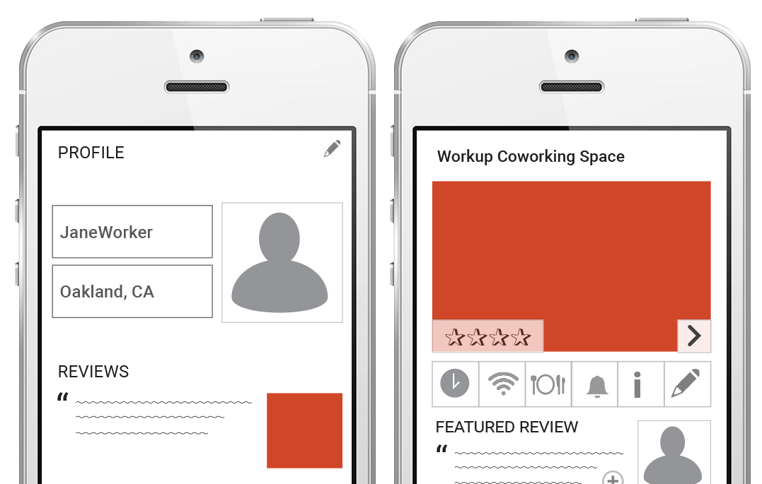
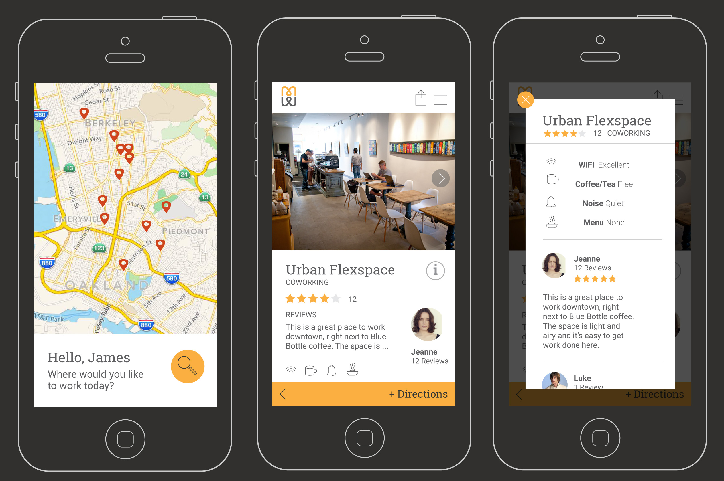
Screen Design & UI
The elements came together for an attractive user interface.
Results
*This product is still in development. I will post links to the completed project once it has launched.